


 Rand McNally pales in comparison. Mapquest certainly holds no candle. These maps were created by artist-engravers in Great Britain, published by the Society for the Diffusion of Useful Knowledge whose object was to "furnish the means of instruction to those who are desirous of acquiring it, and to excite the desire of those who are indifferent to it..."
The maps form a cohesive set because they are defined by graphic rules such as these:
- the horizontal form of the cities is carefully composed within the borders
- the values of black and white are well selected to express and differentiate the many urban elements presented
- heavy lines drawn on the same two sides of structures and built-up areas accentuate and produce a sense of the third dimension by suggesting cast shadows
- structures and built-up areas are made to stand out even more by shading them with fine closely parallel engraved lines which create a grey value contrasting with the lighter value of streets and open areas
- closely parallel engraved lines of different types are used for the "hachures" which depict changes in topographical relief, and for thin wave lines following the land's edge to emphasize a coastline or water front which is always an important "breakpoint" in transportation, form of surface, and environment
- subtle color and tone
I would love to learn more about the process of lithography, seemingly a dying art.
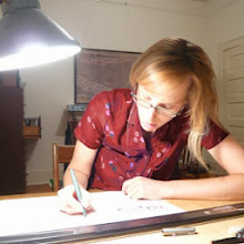
For the past few weeks, I have been attempting to learn from and draw in a manner sympathetic to these maps, with a variety of pens.

 My favorite and the most beautiful pen I have ever seen, a 1940s Parker "51". Isn't this the most beautiful pen? It was also the most perfect birthday gift I have ever received, thank you, Ken.
Micron technical pens are indispensible. And I am learning to use fountain pens with changeable nibs. It is the only way I could find the right width flat tip. I dip it into the ink bottle - it's too thick at first, wanes to the perfect consistency for a while, then the ink peters out and it is time to dip again. I feel so old-fashioned, and I have a nice ink stain on my drawing fingers.
I have defined a loose set of graphic rules for cohesion within what I intend to be a wide family of city maps. Some samples from my palette:
I have defined a loose set of graphic rules for cohesion within what I intend to be a wide family of city maps. Some samples from my palette:


 I do enjoy making lots of small lines under good light, trying to be conscientous, and thinking about things.


2 comments:
Kirsten,
Jeff referred me to your blog ages ago and I have to tell you...I'm a huge fan! I think you're living my dream (Savannah, making things, finding beauty.) Your This Is Savannah project fascinates me. Makes me want to do something similar for Georgetown...Keep it coming!
one more thing...would you mind if I featured you and your work on my blog? I'd love to show what you are up to...
Post a Comment